| All Saints, Darlaston
1951/2 |
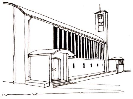 |
In 1952 Twentyman began work on the design for a new
church in Darlaston to replace a Victorian church
destroyed in the Second World War. Once again we see the
bold use of brick for all the elements – the nave,
porch, chapel, tower, sanctuary – with stone used
sparingly for the continuous line of eighteen window
mullions and the surrounds of the two entrance doors.
The emphasis is again on horizontal and vertical
lines but there are more curves here – a gentle arc to
the nave roof, repeated on the porch roof, and the dome
of the separate chapel. |
| There is a severely square brick bell tower with the
bells exposed. The large expanse of window leads us to
anticipate a much lighter interior than Twentyman’s
previous designs. Whereas at St Gabriel’s and St
Martin’s the nave was dominated by large flat surfaces
with monumental arches, in All Saints the great
attraction is the shafts of light entering the building.
The tall windows are set between deep, fin-like mullions
which go some way to hiding the sources of the light;
these mullions are then pierced through at ground level
to create a circulatory passage; an attractive vista is
created down this passage by the perspective of the
receding archways. The sanctuary is separated from the
nave no longer by the traditional chancel arch but by
changes in colour and materials, expensive marble
contrasting with roughcast grey rendering.
Behind the altar was originally a tall, pleated curtain
but this was replaced by the present wonderful tapestry
designed by Stephen Lee and made on a loom on the
rectory table by parishioners over two years! Its
height, colour and abstract design recall the tapestry
of Christ in Majesty in Coventry Cathedral built about
the same time as All Saints. The eagle lectern, carved
from grey stone in a spare, minimalist style, is
wonderfully suited to this building with its restrained
use of line and shape.
There
is constant repetition of linear forms: strong vertical
lines in the windows, the organ screen, the closely
spaced lines of the nave roof, the choir stall fronts,
the entrance doors; and constant repetition of that
gentle arc of the roof – in the aisle passage, the
doors, and elsewhere. There is a greater variety of
materials compared to earlier designs: look at the
marble in the sanctuary, the mosaic under the font.
Again there is a sculpture by Donald Potter – the stone
reliefs on the main doorway showing angels and saints
adoring the Trinity. The chapel is separated from the
rest of the church, this time by steps going down.
Finally, if you’re very observant you’ll notice again
the red and black chequerboard floor of granwood blocks.
Bushbury Crematorium,
Wolverhampton 1954 |
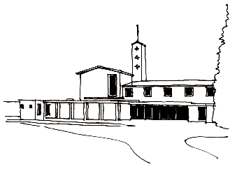 |
The Crematorium has the familiar characteristics of
Twentyman’s work and shares many design details with his
churches. It is a careful grouping of balanced masses –
the West chapel, the chimney tower (like a belfry) and
the office block. The walls are of buff brick laid in a
complex Flemish bond but there is a lot of stone too,
laid in large rectangular slabs: Clipsham stone on the
north wall, window surrounds of cast stone or green
slate, and green marble lining the porch. In addition
the cloister is paved with Honiton stone and the terrace
with York stone. All the roofs were originally of
weathered green copper but the predications of thieves
have unfortunately necessitated the installation of a
much less attractive grey composite material. |
|
Inside
the chapel are familiar decorative features – exposed
ribs in the ceiling, curved bench ends, an array of
small square windows in a six by four grid. There are
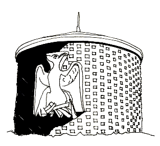
three fine sculptures by Donald Potter: soaring doves in
the chapel, a twelve foot high archangel on the exterior
wall of this chapel, and a phoenix on the circular brick
tool shed in a corner of the grounds, curiously facing
away from the main building, so unseen by most visitors.
The group of buildings takes advantage
sympathetically of the elevated site on the edge of the
city. As mourners leave the chapel they walk under an
elegant, open loggia which overlooks the Garden of
Remembrance and the open countryside beyond. No doubt
Twentyman knew about Gunnar Asplund’s groundbreaking
Woodland Cemetery on the outskirts of Stockholm, built
in 1940. |
 |
| Church of the Good
Shepherd, Castlecroft, Wolverhampton 1955 |
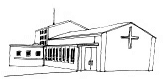 |
This is the Twentyman church that gets overlooked!
It is tucked away among houses and only visible close
up. It has no tower or lofty walls, and no fine
sculptures. But it bears many of the hallmarks of
Twentyman’s designs.
The whole is a composition of cubic masses, though on
a smaller scale here: the sanctuary, the nave, the porch
and the low side aisle – but no chapel. |
|
The
splendid porch (which is not used, so rarely seen) is
faced with large oblong slabs of two types of
contrasting stone and the steps are paved with a third
type. Typically you enter through large double doors
with large, flush-fitting handles. Inside, the porch is
lit by a porthole in the ceiling, like the porch at the
Crematorium (and the old Gas Showrooms in the city
centre).
The
sanctuary is lit by four by three grids of small square
windows in the side walls; the wall behind the altar is
panelled with dark wood. There are characteristic
decorative features – closely spaced vertical lines in
the glass of doors and windows and the familiar curved
bench ends in the choir.
Emmanuel Church, Bentley
1956 |
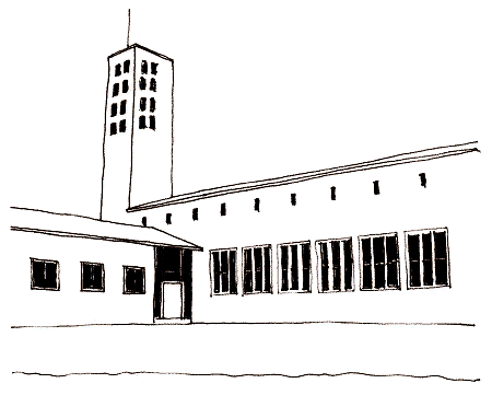 |
The
overall design and the features of this church follow on
clearly from All Saints, Darlaston. Outside we see the
plain walls of brick over a concrete frame; the lofty
bell tower with asymmetrical openings; the copper roofs;
the row of conjoined, strongly vertical windows which
light the chancel and sanctuary. The arrangement of
windows on the nave south wall is reversed compared to
Darlaston – here small slits up high and long windows
below. The asymmetry of the tower is carried on inside –
the different arrangement of windows on the north and
south sides, and a very open aisle on the north side
only, just about separated from the nave by slender
pillars which disappear straight into the ceiling so you
can’t see if they have any structural function. |
| Now they are painted purple; would Twentyman have
approved? The rounded cruciform cross-section of the
columns is reflected in the shape of the stone base of
the font – the sort of attention to detail that can
often be seen in Twentyman’s work.
The sanctuary is separated from the nave not by an arch
but merely by the treatment of the walls and ceiling –
the lines, the materials, the texture – the pattern of
the ornate wooden panelling which fills the wall behind
the altar contrasting sharply with the rough texture of
the nave walls. In the nave long lines are almost an
obsession – the nave ceiling, the wall behind the altar,
even the light fittings. This time the chapel is
separated from the nave by being placed at right angles
to it. The church was built on an elevated site and on
the west side a wide flight of steps leads from the road
up to the church. Unfortunately the view of the church
and the adjoining hall is made less imposing by the
overgrown trees.
St. Nicholas, Radford,
Coventry 1955/7 |
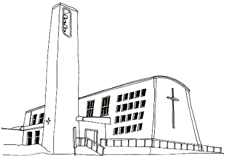 |
Of all Twentyman’s churches this is the most
dramatic in its shape and setting – a hangar like
building with walls which slope inwards as they rise up
and a soaring tower on rising, open ground beside a main
road. The building has a severe, industrial look to it,
maybe reflecting the manufacturing base of the city. It
is, unfortunately, not used any more due to serious
structural defects in the concrete frame, accentuated by
stresses induced by the sloping design. Did Twentyman’s
engineering knowledge let him down here? The
congregation now meets in the adjacent hall. |
|
The
chancel and sanctuary are clearly marked out externally
with a grid of square windows which fills the side wall,
and an east wall covered with a pattern of lozenges and
a large cross. (Most of Twentyman’s churches have a
large cross in this position.) The tall bell tower with
its asymmetrical opening recalls those at Fullbrook and
Bentley. On the base of the tower is a fine piece of
sculpture showing Jesus standing in the prow of the boat
on the Sea of Galilee, his frightened disciples looking
up at him. (Is it by Potter? It is his style.) Inside
there is the familiar arrangement of chancel and
sanctuary differentiated from the nave by lighting and
texture of materials – the east wall is covered with
wooden panelling (like Bentley) in a pattern of lozenge
shapes imitating the outside of that wall. There is a
hark back to the side aisles of the pre-war churches but
here they extend out from the lower part of the walls
under low flat ceilings.
St. Chad’s, Rubery 1956/7 |
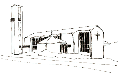 |
St Chad’s has many similarities with All Saints but
is not quite so adventurous; the roof is copper covered
but ridged rather than attractively curved, and the
separate green-roofed chapel is hexagonal rather than
round. We have again the row of vertically accentuated
windows, the cross on the exterior of the east wall, and
the tall brick bell tower with openings for the bells –
but here the tower is separated by a short passage from
the body of the church. It is always interesting to see
how Twentyman arranged the essential elements. The
chapel too is separated by a short passage. |
|
The
end wall of the chapel has bricks laid vertically. It is
said that Twentyman arrived during construction to find
the bricklayers laying them in the normal, horizontal
way; he was furious and personally demolished their
handiwork!
Inside
all is strong vertical lines, including three thin
columns like those at Bentley but here on both sides. We
see a font cover with a tall wooden spike just like
Radford; choir stalls with all the corners attractively
rounded like Bentley, Darlaston and Radford; and the
wall behind the altar has a pattern of oblong stone
slabs arranged in tiers one above the other – like the
wooden patterns at Bentley and Radford.
Of all
Twentyman’s buildings this seems to be the most lovingly
cherished! |
 |
Return to
the
previous page |
|