|
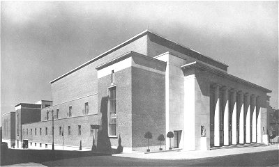
This excellent photograph comes from "Music
in Our Town" by L. B. Duckworth. It is by Stewart Bale. You can see its
great merits even though we have had to crop it, reduce it drastically in
size and otherwise adjust it to make it suitable for this web site. If Mr.
Bale or anyone else with an interest in the copyright would be kind enough
to contact us, we would be much obliged.
Listing: 1936-38. By Lyons and Israel. Modernistic Classical style.
Pevsner: With an eight column loggia, the columns very thin and
octagonal, inspired by Tengbom's Stockholm Concert Hall.
Comment: By E. D. Lyons and L. Israel, of Ilford, who won a
competition. This building contains the large Civic Hall at the front (with side
access aisles and the usual offices) and the smaller Wulfrun Hall at the back;
the two halls are separated by a refreshments area. All of this is clearly
enough articulated in the exterior design. The design is in the tradition
established by the Stockholm Concert Hall. Both halls have a stage and the
larger hall has balconies and a four manual Compton organ. Both halls have good
acoustics.
The hall was ceremoniously opened in 1938. Since then it has been constantly
busy for concerts of all sorts, from classical soirees to rock gigs, for dances,
for the University's degree ceremonies and anything else a well designed and
well placed civic hall might be used for. It is one of the more austere pieces
of architecture in the town centre but has fond memories for many townspeople.
A refurbishment programme was started in 2000. One of the last
performers before this work started was Victoria Wood, who declared she would
never return to the place after the lavatory cistern in her dressing room fell
on her head. But the plans for the refurb persuaded her to change her mind
and she gave a brilliant performance in July 2001, despite the excessive heat
which the re-furbed hall seemed quite unable to cope with. Unfortunately
she made no comment on either the old hall or the new.
The architects for the alterations were Penoyre & Prasad, of London.
The work met with a mixed reception. It received a Civic Trust
Award in 2004, the Trust commenting that "new life has been breathed
into this restrained Art Deco building ... with the original design
being respected throughout". Others, however, objected to the fact
that the glass boxes attached to the sides failed to respect the
original design at all. Here are some interim comments by Duncan
Nimmo (with Frank Sharman) and Duncan's photos.
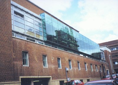 |
The most noticeable result of the refurb has been the
appearance of this green glass excrescence and a matching one on
the other side. If you compare this with the top picture you
will see how the original concept of clean geometric blocks,
articulating what is within, has been entirely lost. How
anyone managed to do this to a listed building is beyond us.
In this photo you can also make out some examples of
re-pointing, which has been done in a way that leaves no doubt
that it is new work, and which looks awful. |
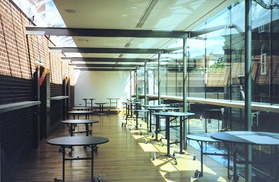
| What you get in exchange for this drastic change to the
building's appearance is this. |
 |
 |
These rooms appear to be extensions to the bars but are
probably adaptable to other uses as well. You also get some new lavatories.
Whether any of that was needed is not really clear, leaving the distinct
impression that the gain, whatever it is, is far outweighed by the loss to
the external appearance of the building. |
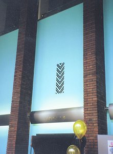
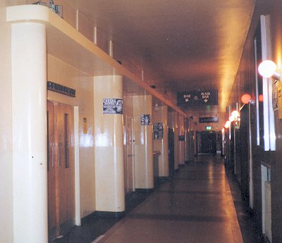
| Moving inside the building, the council's efforts have
been more successful. This is the foyer where, as in many parts of the
interior, the most noticeable changes are to the colour scheme and the
signing. The chevron pattern is original - it seems to be part of the
ventilation system. |
 |
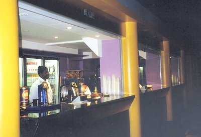 |
The main hall (and we have not yet seen the Wulfrun Hall)
and its side corridors are not much changed (though the improvements to the
lavatories are considerable). But some parts look radically different.
Presumably the council felt a need to set off in hot pursuit
of the modern clubber and this is the result. It retains aspects of
the original style.
|
On the left is the old style of sign. On the right is
the new style. The lettering in both cases is some sort of Frank Pick
style and the new preserves the feel of the old and is not out of keeping
the original style of the building. But the old three-dimensional
chrome letters were a very characteristic feature of the time of the
building and ought to have been kept.
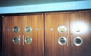
| Here the signs above the doors are new but whether or not
the door furniture is new or merely cleaned up we cannot quite work out -
which may well say something about how well it has been done. The
portholes and half moon shapes are a trade mark of the original building. |
 |
 |
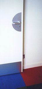 |
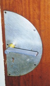
The door handle and plate on the left is one of the
originals. The door on the right is one of the new ones, which
maintains the style well, without being a copy. |
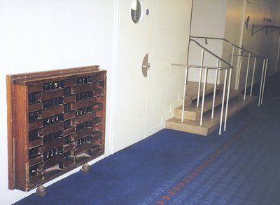
| The new carpet reflects the chevron pattern which appeared
throughout the original building. These stairs and railings, like many
others, have been cleaned up but otherwise left.
Note the new door
with porthole and half moons; and the radiator cover, which is one of the
originals, all of which seem to have been retained - but would probably have
benefited from a bit of restoration work. |
 |

These windows have benefited from a clean up but otherwise
being left alone. |
Our feeling is that the changes to the exterior should
never have happened; but the work on the interior is quite a
commendable effort: the appearance has been up-dated without totally
destroying the style of the original.
One might now add that it has transpired that the refurb
did not make provision, other than the minimal, for selling tickets. This seems to be a basic omission which the city council is trying to
deal with by expanding the information centre in Queen Square by
building sideways over Woolpack Alley.
So that part of the city's
historic street pattern, one of its few remaining links to the medieval
town, is to be sacrificed because of the inadequacies of this scheme.
|

|