|

Listing: 20 & 21: mid C19. 22: mid C19
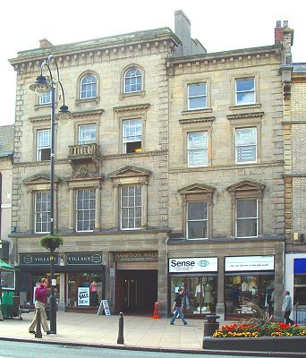
Comment: the building to the left (20 & 21) is a fine and rather
correct building, except for the funny little balcony, which must be decorative
rather than functional. The building to the right (22) tries an interesting
visual trick. The fenestration is not central but tries to look that way by
filling the gap on the right with quoining and visually borrowing the similar
quoining from its neighbour. Presumably the whole lot was built at the same
time.

|