|
Banks, Offices and Commercial Premises
There
has always been buildings devoted to large-scale commerce such
as the Bank of England and Custom House, but they were mainly in
London. Smaller businesses often occupied rooms in a house.
However in the early 19th century commercial buildings began to
emerge with a distinct and separate existence. Insurance and
banking went through a rapid process of transformation, partly
as a result of the financial legislation in the 1840s that
helped to shape the security of investment. Much bank and
commercial architecture began to reflect this increased
confidence.
The
other types of commercial premises that began to emerge were the
so called “Office Chambers”. By the end of the 19th century the
process of separating offices from living quarters was virtually
complete. Due to the need to maximize land use there was a
demand for greater height and as artificial light was not yet
feasible, larger windows. To give an impression of stability
many were built in the Classical style, but this caused
problems, as the style was not always compatible with tall
many-windowed facades. Wolverhampton has many fine “Chambers”;
perhaps the most notable is the Quadrant Building in Princess
Square built in the 1890s. Although the ground floor has been
altered to accommodate shops, the upper part of the building
still retains its fine façade. Another fine set of offices is
Gresham Chambers, opposite the Art Gallery.
Queen
Square has some excellent buildings and part of the attraction
is the three fine banks that face it. Of these the finest must
be that housing Barclays Bank, built in 1876. The original
design was by T.H. Fleeming, but it was added to on subsequent
occasions. It is a masterpiece of Gothic architecture containing
a bewildering variety of features. It is of three storeys with
slightly projecting gables with arches either side. There are
turrets, and facing Lichfield Street, to the left of the door
leading to the chambers, a loggia.
|

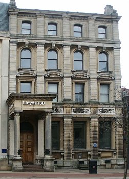
Lloyds TSB bank in Queen Square. The
Italianate facade of the building works very well. The extension to
the building, on the site of the old Queen's Ballroom has been very
sensitively carried out. |
Although
Barclays is a masterpiece, Lloyds is probably a more architecturally
correct building and a great deal more restrained in the Italianate
style. Although the façade is as Pevsner says,
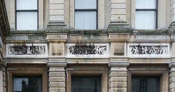
“sparing in motifs”, there are some interesting relief panels
showing industrial scenes placed somewhat incongruously on the
front. The left hand panel shows a scene in a coalmine complete with
cage, winding gear and coal truck. The middle panel shows an
agricultural scene with heavy carts full of produce. The right hand
scene shows heavy industry with drop forgers at work; in the
background there is a rolling mill in operation. The panels are a
deliberate attempt to show scenes of plenty and the fruits of
labour; they also indicate, whether intentionally or not, the twin
sources of much of the town’s wealth. As the Art gallery and Bank
share the same architect and were built at the same time, the panels
are by Boulton of Cheltenham, as are those on the former building.
The National Westminster
Bank on the north side of the square is in marked contrast to
the other two, caused partly by its white stone. Corinthian
pilasters separate pedimented windows. |
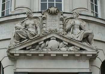
| It is of
three storeys with a balustrade disguising the roof. Over the
doorway are two figures representing Industry (with a hammer) and
Agriculture (with a cornucopia).
A commercial premises
occupies one of the most massive pieces of Victorian
architecture in Wolverhampton, that of the Royal London Mutual
Insurance, built at the end of the period, 1900 to 1902. |

The exquisite carved panels on Lloyds Bank,
showing left to right, coal mining, agriculture and industry. |
| We have said
before that the Victorians built in a wide variety of architectural
styles. The Baroque style of this building was a late development of
the 19th century, a reaction against the “Free Style” which had
developed combining Classical with Gothic motifs, well illustrated
by the library. Of particular interest on this building is the use
of glazed terracotta over the entrance. There is a mass of carving
on the building carried out by the firm of Carter and Co. of Pool. |

The fruits of agriculture and industry are personified by the two
figures above the door of the NatWest Bank. |
In an
early chapter, it was pointed out that Wolverhampton was very
much a market town and many of the commercial buildings erected
had an agricultural purpose; sadly these have now entirely gone.
The
Exchange public house is a reminder that near to this site stood
the Exchange building, erected between 1850 and 1853 to a design
by G.T. Robinson. The building was originally intended as a corn
exchange for farmers and millers. Shares raised the money for
its building, £15,000.
|
|
The
main room was 120 feet by 50 feet and had a gallery, a permanent
platform and an orchestra pit capable of containing over one
hundred players. Despite this the acoustics were apparently
dreadful. The Exchange was also used for ironmasters and other
public meetings. There were newsrooms attached to the building,
which were well supplied with national and provincial papers.
From
the start the building proved to be unsatisfactory and there was
an acrimonious public debate as to where blame should lie. The
Secretary of the Exchange Company tried to blame the architect
as the building was poorly lit, badly ventilated and the sound
was poor. Good lighting was essential to the corn merchants who
needed to see the quality of the corn.
One
feature of the original building was a large cupola which had to
be removed almost immediately as it began to subside into the
building. The architect who advised removal was Ewan Christian
who was called in for advice. It was said at the time that it
was the only building ever built with the foundations at the
top. The Exchange did not have a very long life, being
demolished in 1898.
|
| A fairly
recently demolished commercial building was the retail market. This
had been opened in March 1853 at a cost of £30,000 and built to a
design by Lloyd of Bristol. Photographs of the building show an
impressive Italianate classical façade with entrances in North
Street and Cheapside. The Market, which came into the hands of the
Corporation yielded between £3,000 and £4,000 per annum in 1896. |

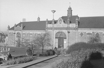
The
Wholesale market. “A pretty building” |
| It was
reported in the same year that this was gradually increasing. Its
main interesting features were the hollow, cast-iron columns, which
not only acted as a support, but carried away rainwater also.
We have confined
ourselves rather strictly to those buildings which qualify as
Victorian, but one exception is the Wholesale market, which was
built in 1903-4. “A pretty building”, according to
Pevsner, it was demolished in the 1970s.
|
 |
|
 |
|
 |
Return to
Schools
and Colleges |
|
Return to the
contents |
|
Proceed to
Entertainment & Leisure |
|